Streamlining the application process for new talents
Works / Web App / Feature Design
Context
Background
As the sole product designer in the company, I work alongside the product owner and two developers, supported by a BA and a QA tester in an agile team. My task includes gathering insights, defining problem and conceptualizing solution and designing prototype for the platform.
tools
Adobe XD, Canva, Miro
Timeline
2 weeks
Overview
How can we streamline the users’ experience across the application process?
challenge
As part of its mission to drive growth, Works, a leading AI-powered web3 hiring platform aims to refine the application process for new talents to strengthen its capability to attract, engage and onboard exceptional talents effectively.
Solution
I designed an application dashboard that offers clear progress tracking, easy access to support and eliminates fixed assessment deadlines, giving users more control and transparency over their entire application journey.
Process
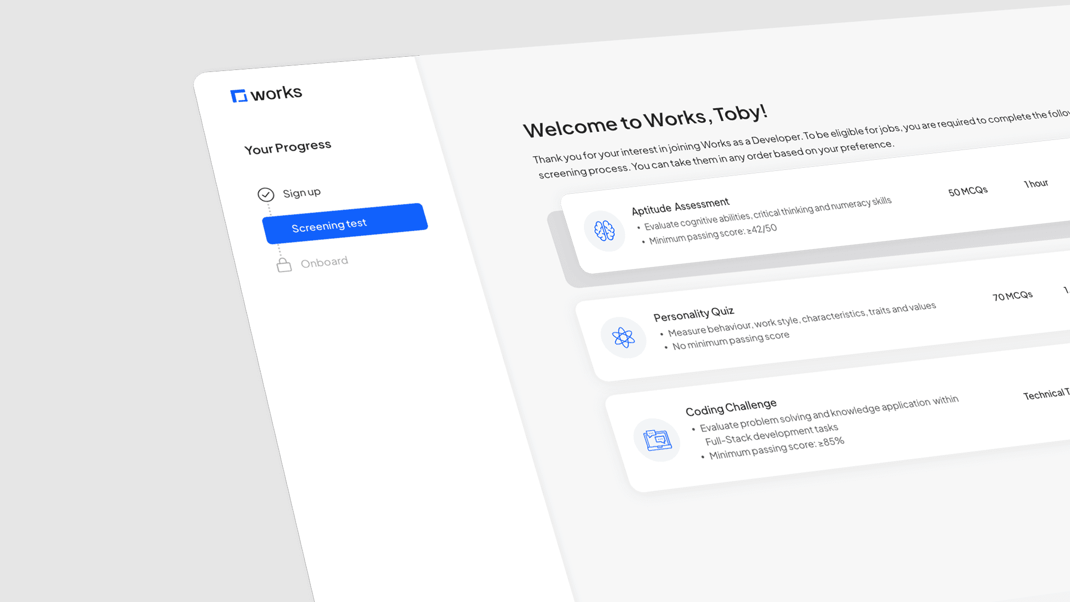
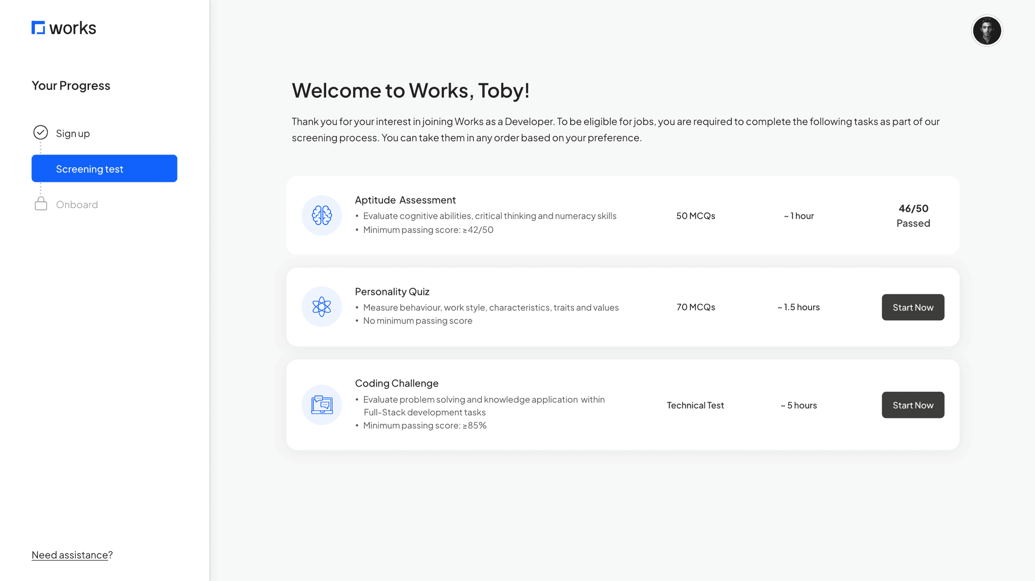
Reviewing end-to-end application process
Process audit highlighted inefficiencies within the application flow
I began by mapping the existing application journey to familiarize myself with the process and identify any potential friction points.
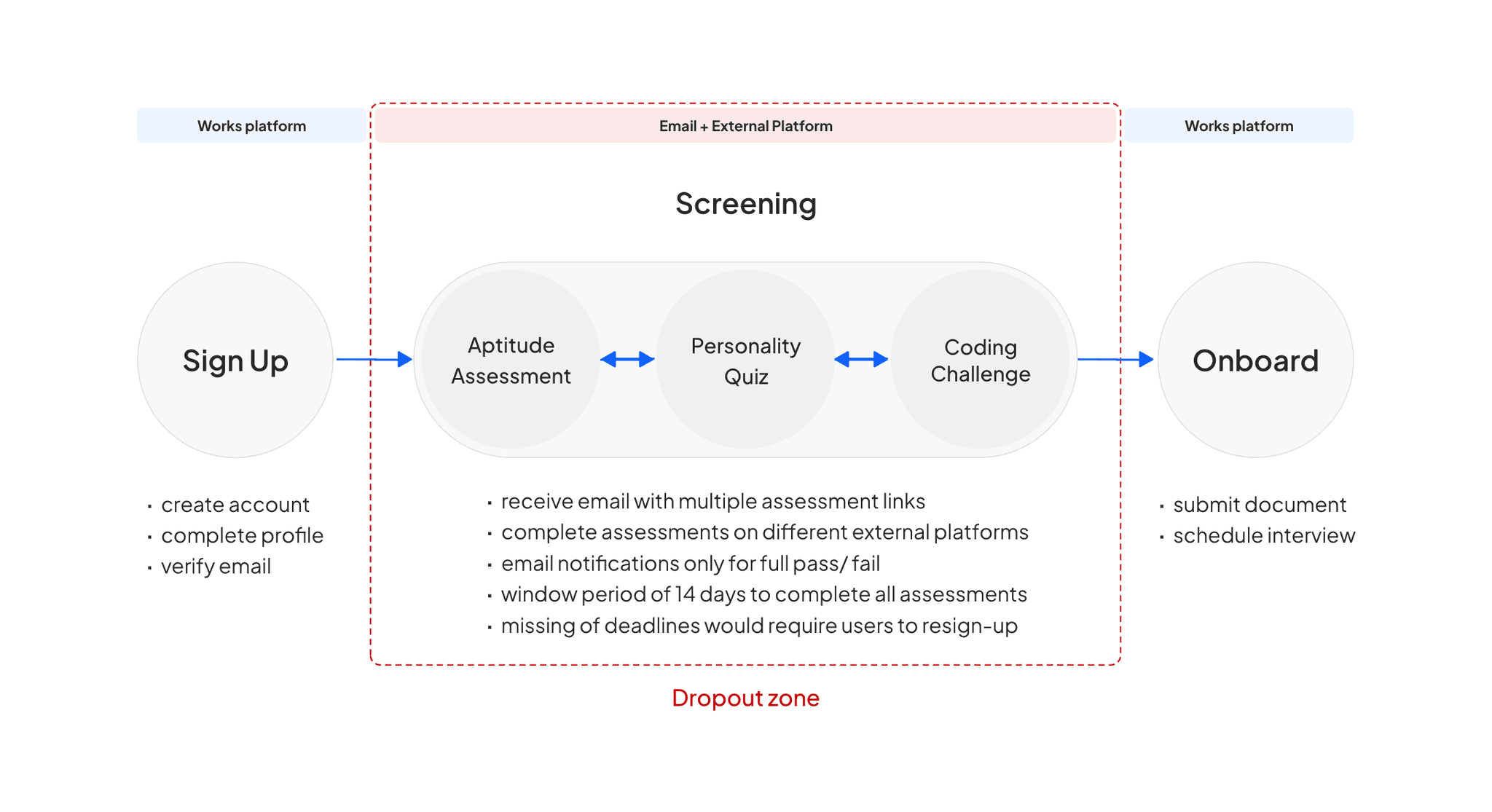
Key issues
Back and forth navigation between email and platform
No clear guidance for the next step
Unable to view completion status nor track unfinished assessments
Benchmarking against competitor
Competitive analysis revealed several opportunities for enhancement in our platform
I analyzed two direct competitors to familiarize myself with their platforms’ screening process. The goal was to identify common practices and discover strategies that we can leverage.
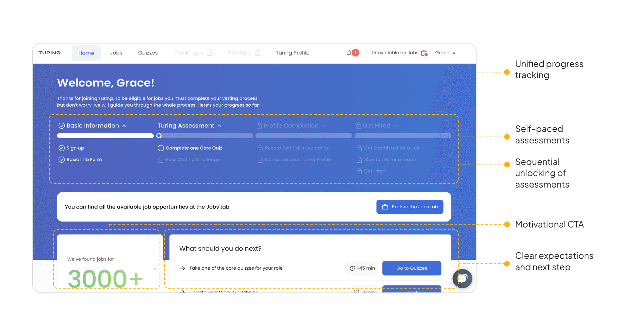
Turing
Remotebase
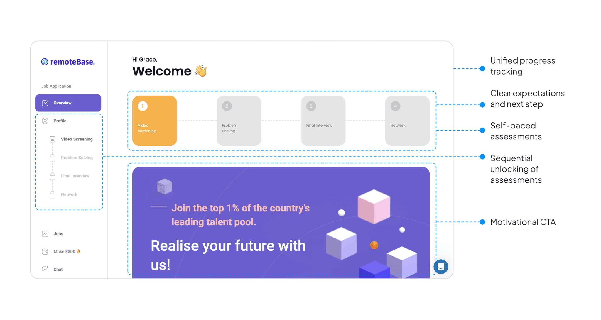
Looking at these players, I discovered that both apps offer similar features. I hypothesized that these features, such as unified progress tracking, clear tasks guidance, and sequential unlocking of assessments, which we lack, could be key to engaging users and that integrating similar strategies into our platform could improve users experience, particularly on navigation.
Validating Assumptions
Survey from 30+ respondents revealed challenges with flexibility, navigation and clarity
To validate assumption and identify pain points, i sent a qualitative survey to 45 candidates who had not completed their application within the 14-day window. The goal was to understand the friction in the process that causes the discontinuation and gather insights into their overall experience.
What was your primary reason for not following through with the assessment?
How would you rate the navigation experience?
How satisfied were you with the visibility of your progress throughout the application process?
How easy was it for you to find help when you encountered issues during the application?
Key findings
Missed deadlines were identified as a primary reason for drop-off
There is a strong demand for deadline flexibility and reminders
A majority of respondents reported dissatisfaction with their ability to track progress
Most of the respondents highlighted the navigation as ‘poor’
Many found it difficult to search for help
defining problem
Lack of control made it difficult for users to manage, track and navigate their application process
Based on the researches and insights, the biggest theme discovered was centered around a lack of control and it can be broken down into 3 key areas:
Flexibility
Fixed deadline
Clarity
Navigation & tracking
Assistance
Support & guidance
How Might we…
Give applicants greater control and transparency over their application journey?
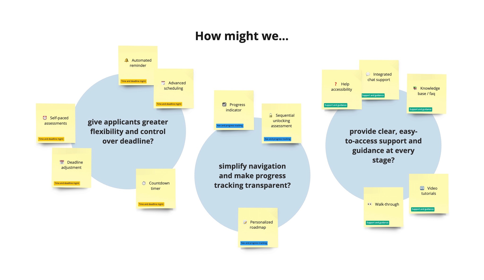
Brainstorming Functionalities
Supporting HMWs statements guided the ideation of functionalities
After analyzing the pain points and insights, HMW statements were established for each key area to guide the ideation process and generate features. The goal was to extract a list of features that we could have for the solution without overcomplicating the process.
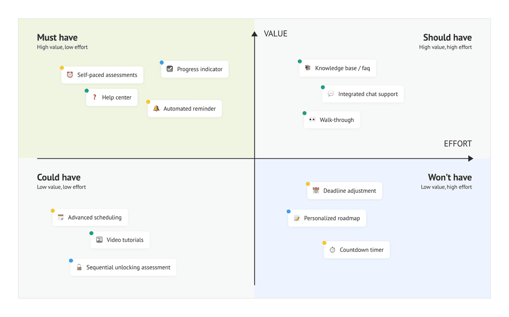
Prioritizing Functionalities
Resource constraints led to the functionalities prioritization using the MoSCoW method
To address user pain points effectively within resource constraints, I used the MoSCoW method to prioritize features that deliver the highest value and require lowest implementation effort, while eliminating any overlapping features.
Convincing Product Owner
Removal of fixed deadline based on financial impact analysis, competitor insights and reminder feature (proposed)
During the prioritization discussion, the product owner expressed concerns that removing deadlines might cause candidates to lose momentum as initially, the deadlines were implemented as a way to create urgency for completing the applications quickly. However, it was evident that candidates prefer flexibility in the application process.
To address the product owner's concerns and demonstrate the potential benefits of removing deadlines, I took the approach:
Financial impact analysis
Collaborated with BA to evaluate the costs of keeping vs removing deadlines.
Cost per dropout
Revenue loss from dropouts
Missed applicants cost
Insights from competitive analysis
Adopted and presented insights from competitor analysis done earlier to highlight the industry standard and the success competition have with flexible application timelines.
Based on these insights, stakeholders agreed to trial the implementation of flexible timing without a fixed deadline. The decision was made with the consideration that automated reminder could help mitigate the risks by keeping applicants engaged and prompting completion.
Approaching a solution
A dashboard that allows users to self-pace assessments and track progress, all in one place
Insights revealed that the ideal solution must be able to offer users the flexibility to manage assessments at their own pace while providing assistance and clear visibility into their progress.
This led to the idea of a centralized dashboard. Competitor analysis further reinforced this approach, revealing the industry standard.
Proposed user flow
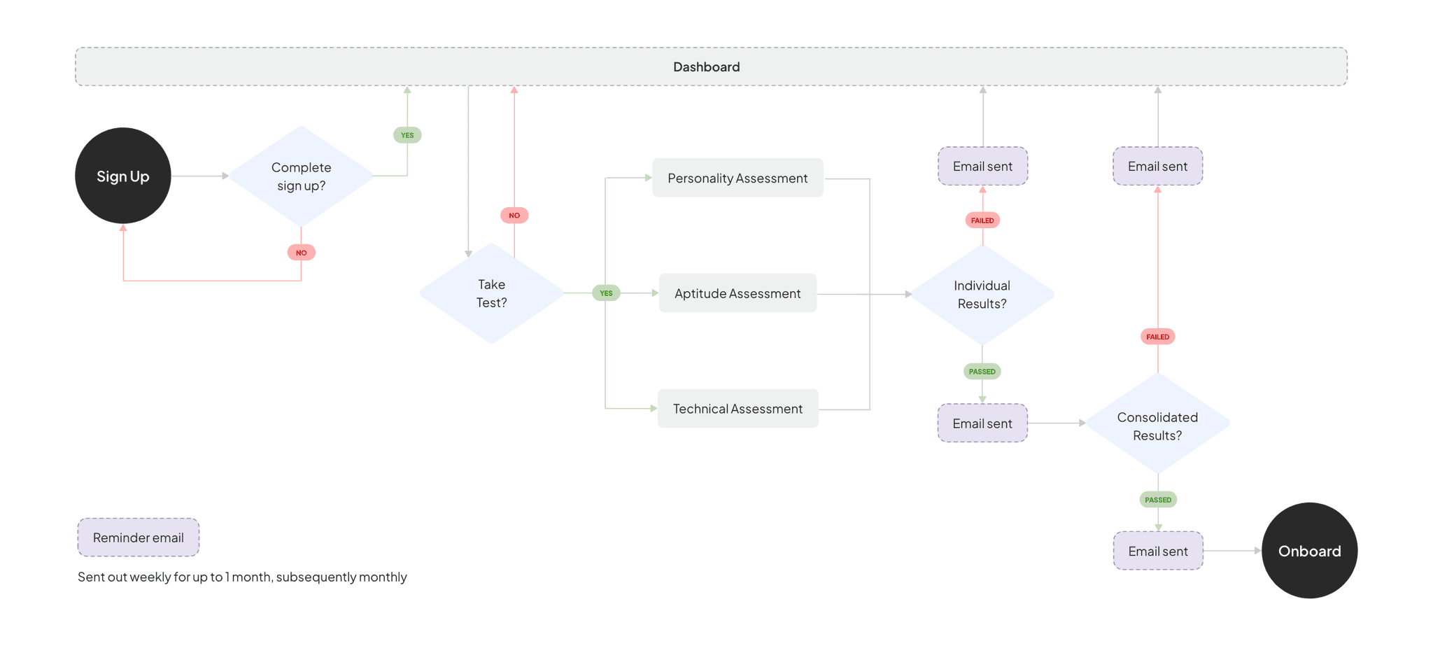
Reminder Email
The schedule is designed with the goal of maintaining consistent engagement without overwhelming users. While no specific research was conducted on exact frequency, this approach is based on best practices with several key considerations:
Initial engagement and habit formation
- Weekly: keep users engaged, reinforce task completion, establish a routine
User fatigue and relevance
- Monthly: provide continued nudges, not overwhelming, reduce risk of notif fatigueIndustry standards
- more frequent initially, taper off over time
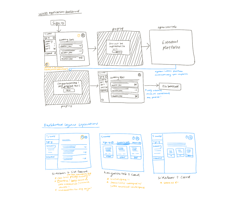
Designing low-fidelity wireframes
Defined interface layout with low-fidelity designs
I began by exploring several dashboard layout options and gathered feedback from colleagues and product owner to understand their preferences.
After multiple iterations and feedback sessions, we decided to adopt a sidebar and horizontal card format. This decision was made to ensure that essential tools are easily accessible while maintaining a clean and organized layout. The side bar provides a clear and consistent navigation structure while the horizontal card enhances visual hierarchy.
First draft
Created the first round of high-fidelity prototype for usability testing
Iterations from usability test
Moderated tests with 4 users informed iterations that helped reduced confusion and hesitation
I asked 4 users to navigate through the Works talent application dashboard and complete a series of tasks to understand their experience. I first asked them to locate the assessment section and review the details of available assessments, then I got them to select an assessment and attempt to start it.
Key insights
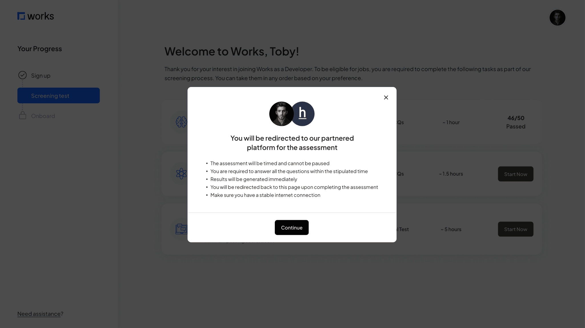
Most users misinterpreted the “~ x hour” as an estimate rather than the actual assessment time frame, leading them to believe there was flexibility until they clicked into the assessment and discovered a fixed time limit.
A majority of users hesitated when attempting to click the ‘start now’ button, citing that they wanted more details on the assessment, such as tools/ software they should prepare, sample question and other relevant details that could affect their performance.
🤦♀️
"When I saw the hour thing, I thought that's roughly how long the assessment need. Had no idea it was timed until i clicked in."
💁♂️
"Would be nice to know what I'm getting into before hitting start. Like, I don't want to start and then realize ..oh wait, I actually need Python?"
🙇♀️
"I kept looking for some kind of checklist or sample question before starting. The 'start now' button feels very... final?"
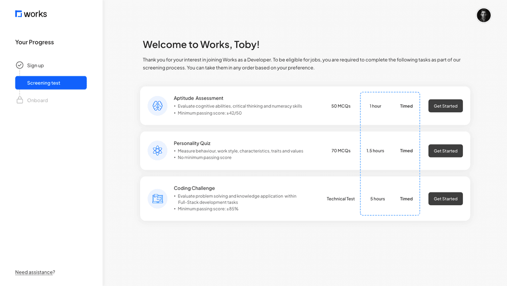
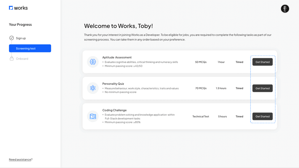
Clarified assessment time limitation
Users were confused by the ‘~ hour’ symbol and mistaken it as an estimated duration. To reduce the confusion, I removed the symbol and added a ‘timed’ column to communicate that the assessment has a set time limit.
Made the CTA less intimidating
The original ‘Start Now’ button caused hesitation and uncertainty. I changed it to ‘Get Started’ which feels more approachable and give users the impression that there is more guidance before they begin.
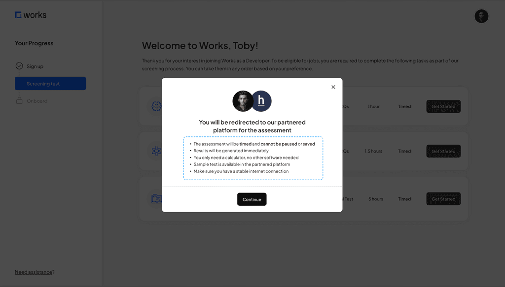
Enhanced pop-up information for better clarity
The pop-up does not provide enough information for users pre-assesment. I revised the content to include concise details about preparation and expectations, ensuring users feel well-prepared and informed.
Next steps
Development and validation phase
The next step involves handing the design over to the development team for implementation, followed by a QA test before it is deployed to live.
To measure effectiveness, key metrics will be tracked for a month after deployment:
Completion Rate
Target of 20% completion rate within 14 days (original deadline)
Reminder
Target of 30% open rate and 20% click through rate
Key learning
The power of speaking stakeholders' language
When I first proposed to remove the fixed deadlines, I was faced with strong resistance. My initial backing was heavily rooted in a user experience perspective - showing user feedback, drop-off points and competitive insights, but to no avail. It was only when I shifted to speaking the "language of business" that things changed.
This has taught me important lessons about stakeholder communication, that it is not just about having data, but to present it in a way that aligns with the business' priorities and goals.
Crafted with love and many cups of matcha latte 🍵
© 2024 Portfolio by Grace Pang