Increasing user sign-ups by 18% with a website redesign focused on showcasing value
Works / Website Redesign
Overview
Company
Works is an AI-driven Web3 work platform that facilitates companies in matching and hiring of software developers within 48 hours, leveraging artificial intelligence.
Timeline
2 weeks
why the redesign
User feedbacks revealed several critical challenges
Feedbacks were received as the company started acquiring more clients, talents and recruiters. Users consistently expressed confusion and hesitation about the platform:
🙆♀️
"Im interested to join but I am curious about the comms structure and generally how it works. There doesn't seems to have much information on that."
👨💻
"I came across your platform and I’m keen. Will I be guaranteed jobs after joining?"
👨💼
"I’m considering using your platform for recruitment, but I need some clarification regarding the process before committing."
Project requirement scope
Discussion with the product owner defined the project goals and requirements
Business objectives
Improve clarity
Enhance user experience
Strengthen brand identity
Constraints
Time restriction
Branding guidelines
Tone consistency
Process
Website audit
Audit revealed gaps in brand alignment, content strategy and perceived legitimacy
Key observations
Vague value proposition failed to communicate brand vision and offerings
Lengthy page with repetitive content
Lack of engaging visual elements with a flat look and feel
Excessive use of stock images make the website look non-legitimate
Inefficient layout utilization
Weak call-to-action
Information architecture audit
Evaluation showed existing information architecture had usability and navigational issues
Key findings
Illogical and unclear content categorization
Ineffective content labeling for different user types
Content redundancy across pages
Competitor benchmarking
Analysis revealed opportunities to enhance our UI through community-driven design, futuristic inspired visual storytelling and content-first approach
I conducted competitor analysis to learn the strengths and weaknesses of these platforms, focusing on the visual design, navigation architecture, content strategy and general user experience.
Toptal
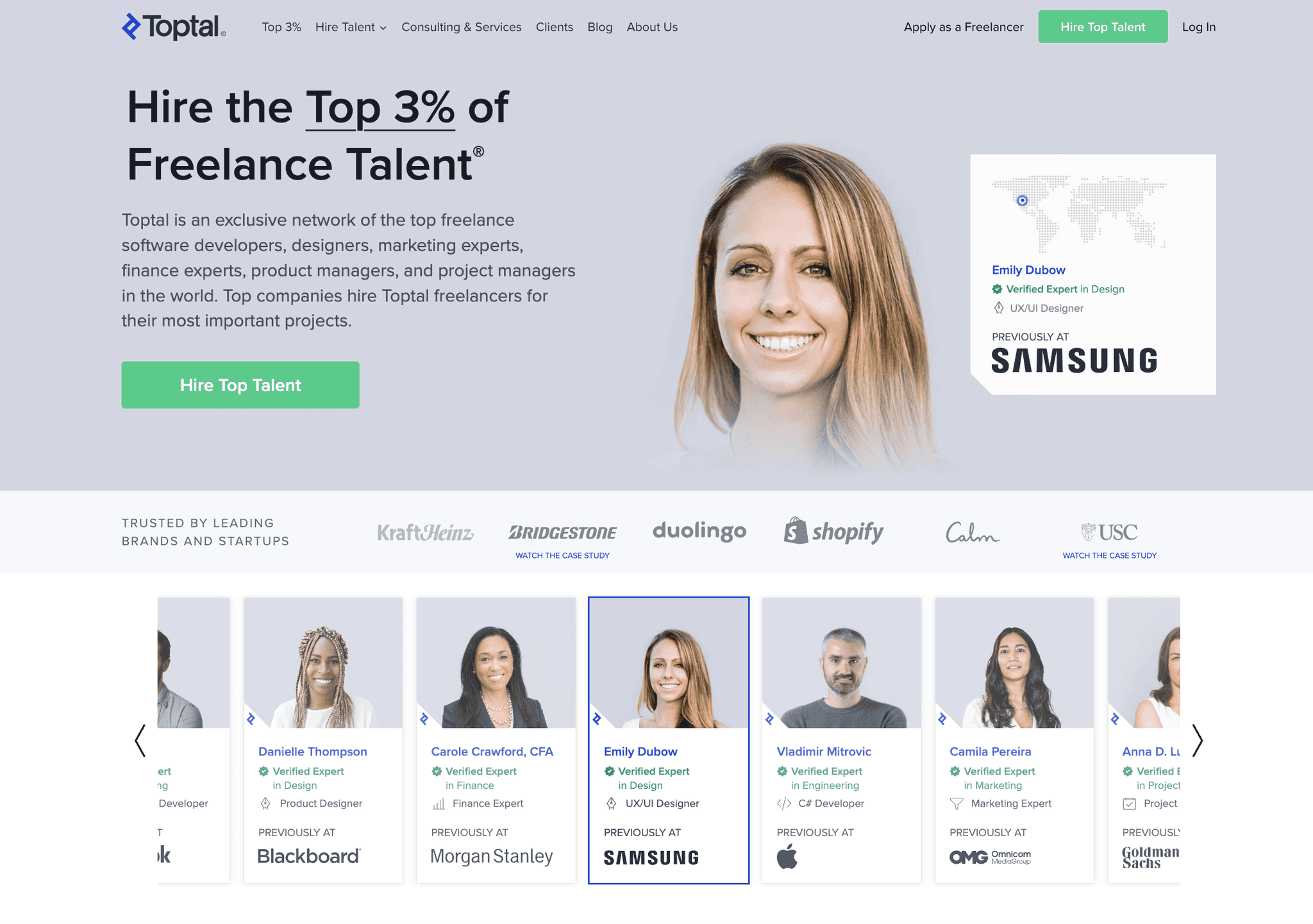
✔️ Precise content, professional, clean and consistent
❌ Lack emotional engagement, technical jargon, rigid content
💡 We can differentiate by using story-driven design to highlight recruitment process, balancing credibility and engagement
Turing
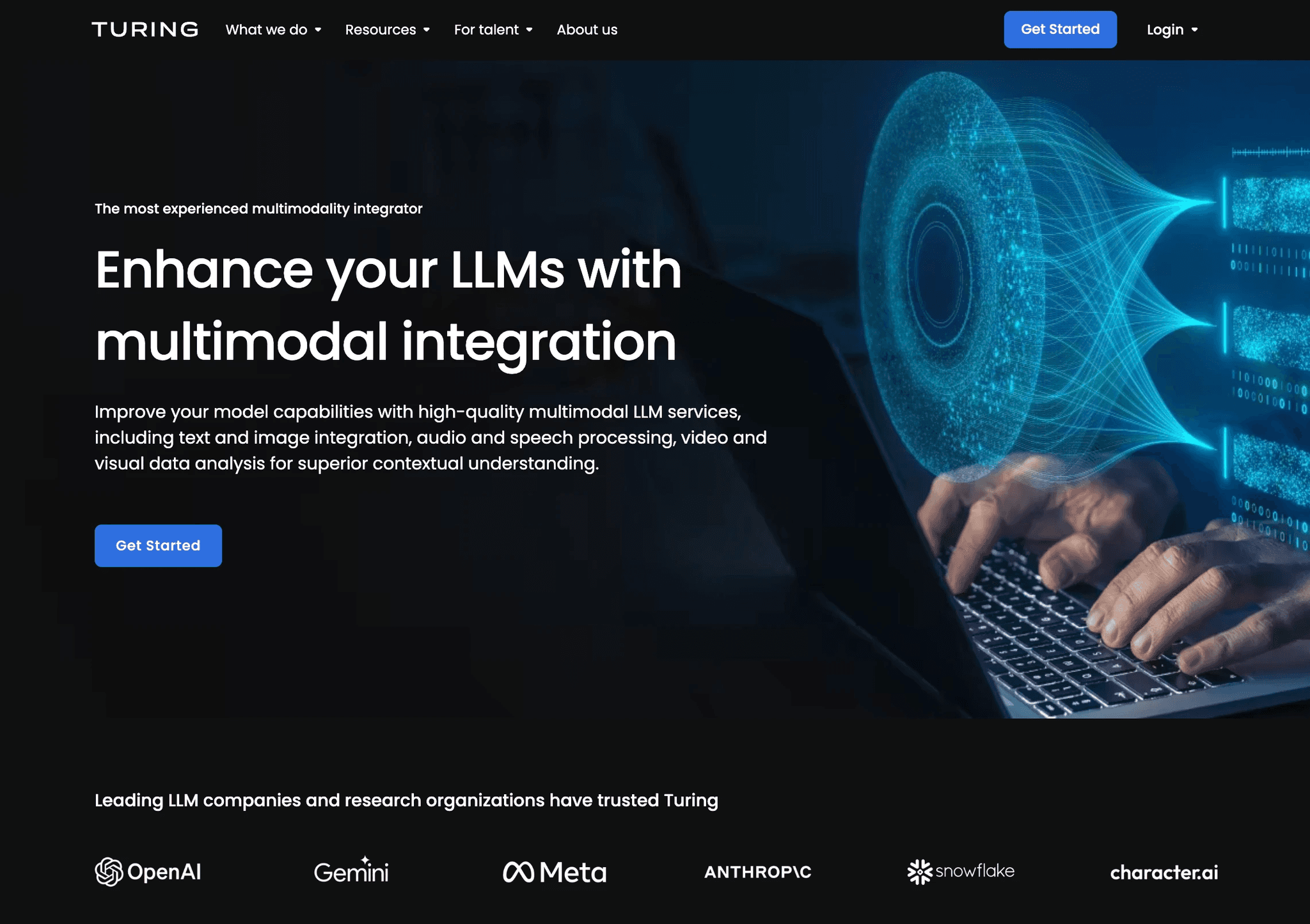
✔️ Simple navigation, futuristic UI, clear user path
❌ Technical jargon, overly technology-driven
💡 We can adopt some futuristic elements to convey the AI solution in the platform, enhancing visual storytelling
Remotebase
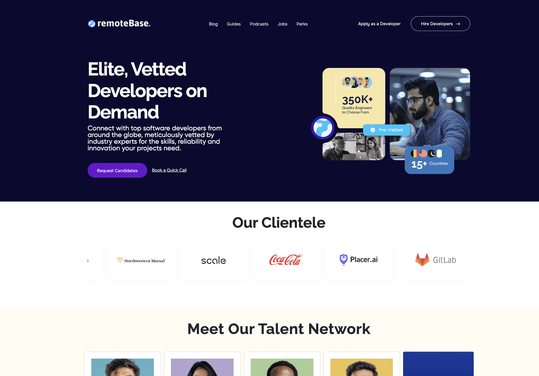
✔️ Clear navigation, strong focus on delivering content and value
❌ Inconsistent color scheme, cluttered interface
💡 We can adopt a content-first approach to deliver clear value and info to users, enhancing engagement and clarity
Redesign strategy
Insights and business objectives directed a redesign focused on improving navigation, visual identity and content strategy
With the insights, I outlined the design requirements and how we can differentiate ourselves while making sure that the requirements are aligned with business goal.
01
Role-centric navigation restructure
Segments user content by user type (talents, clients, recruiters)
Provides clear, intuitive pathways and remove redundancy
Adds contextual guidance
02
Visual identity revamp
Balances professionalism with human connection and sense of community
Incorporates futuristic design elements
Reflects ai and web3 innovation
Prioritizes visual storytelling
03
Content strategy refinement
Clarity and value delivery
Simplify complex technical concepts
Creates emotional resonance
Highlights platform's unique capabilities (key differentiator)
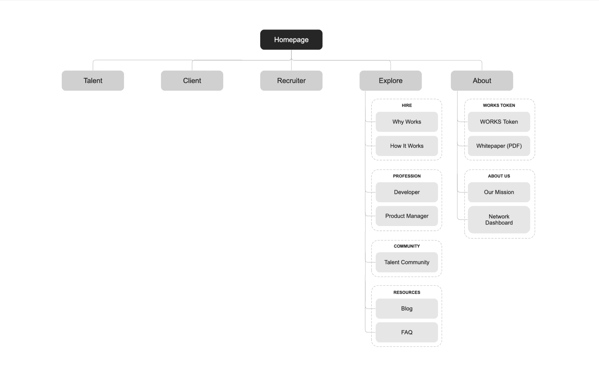
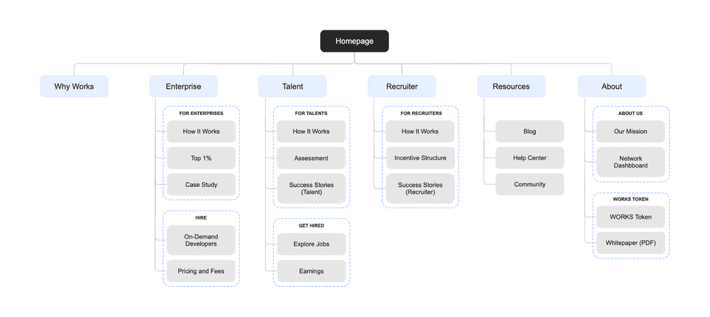
Restructure information architecture
Reorganizing key pages to simplify navigation and improve content accessibility
New information architecture aim to…
Group pages by user type to ensure content relevant for specific audience
Create clear navigation paths to guide users intuitively through the site
Remove redundant pages to minimize confusion and improved content discovery
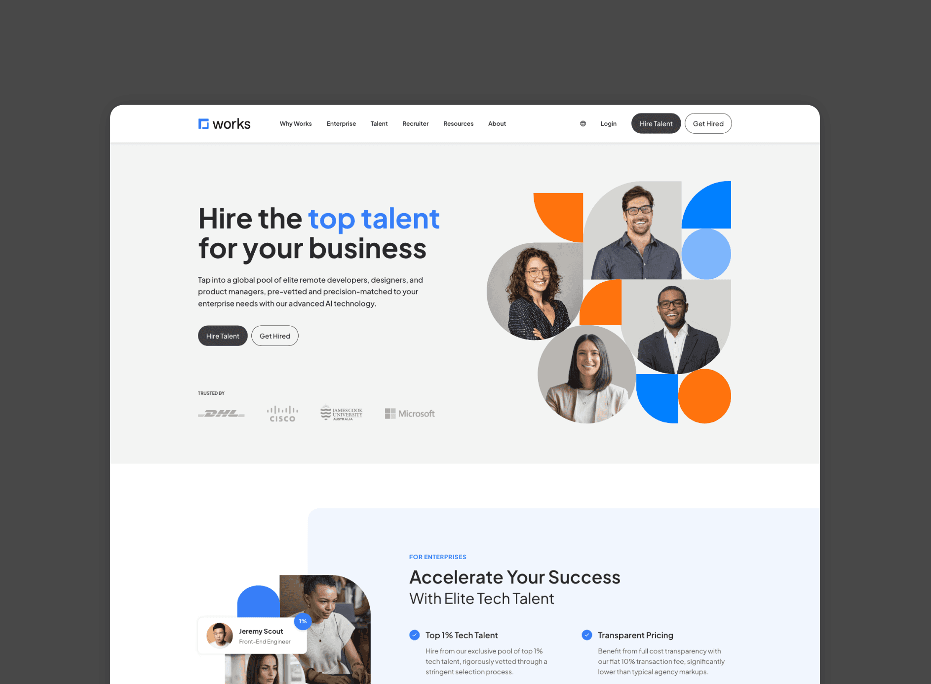
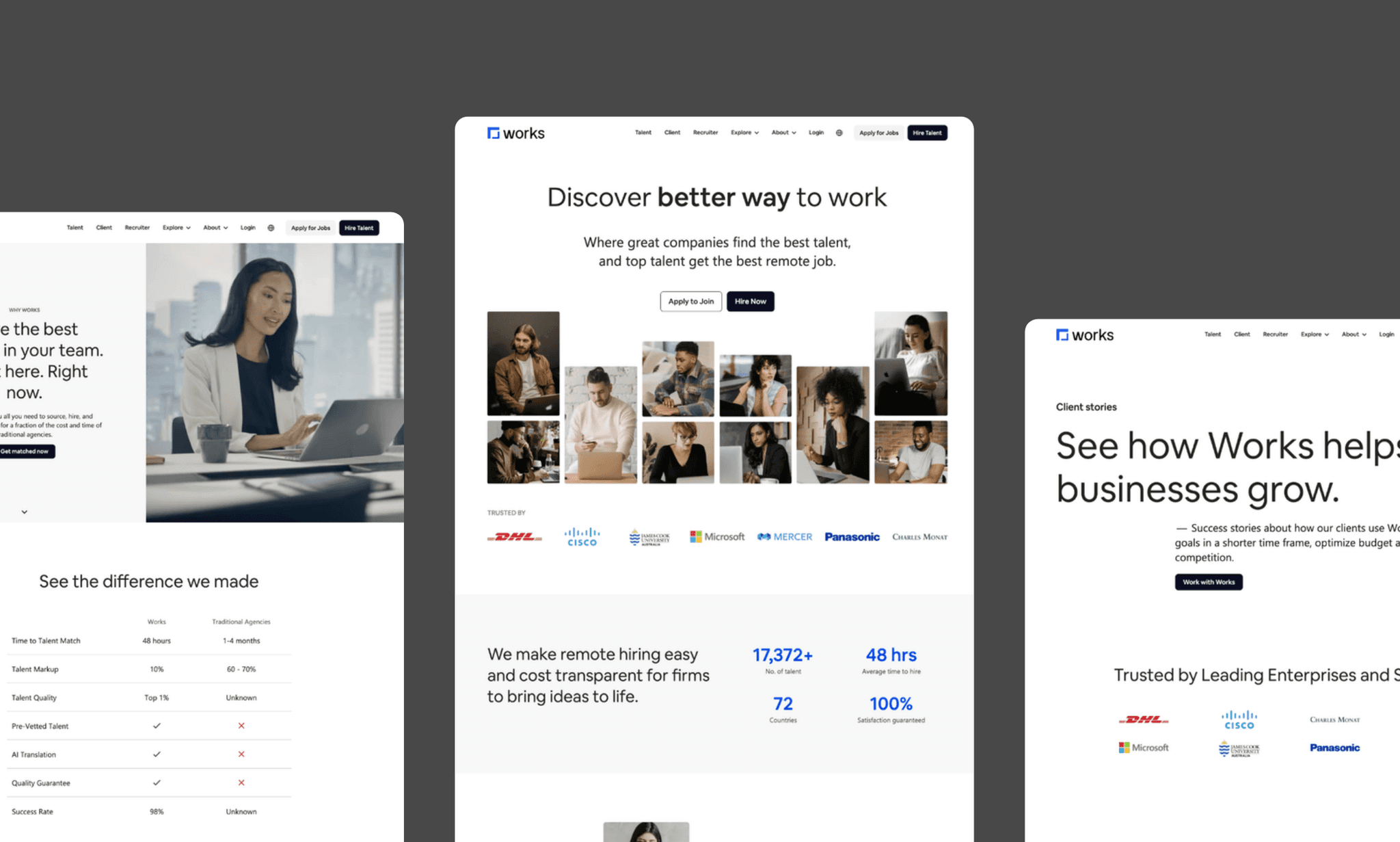
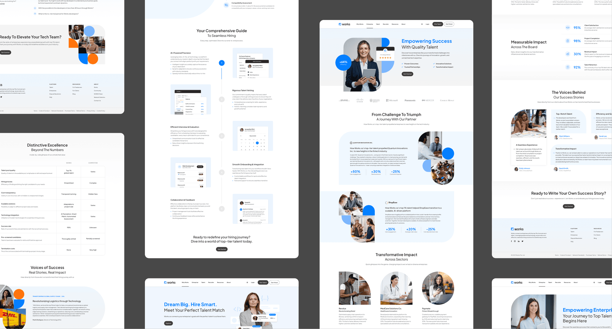
Final Outcome
Key improvements
More vibrant and professional color palette (color coded for different user types)
Custom graphic elements help user visualize processes intuitively
Storytelling approach that integrates content and visual for better engagement
Community-focused, candid imagery for emotional connection
Clearer hierarchy and efficient utilization of space for easier navigation
Strategic and comprehensive content that delivers value with clarity
Impact
Redesigned website boosted user engagement and strengthened brand credibility
User engagement improvements
13% increase in session duration
10% reduction in bounce rates
21% increase in CTA interactions
Business impacts
18% increase in user sign-ups
37% reduction in cust. support queries
↑ significant increase in brand trust
key takeaways
Repurposing existing assets becomes a critical strategy when the demand for visual content production is high and deadlines are tight.
Daily standups with stakeholders plays essential role in ensuring issues and questions were addressed promptly.
There is a need to forego certain 'standard' steps and find for practical alternatives when the situation calls for it.
Crafted with love and many cups of matcha latte 🍵
© 2024 Portfolio by Grace Pang